Artona Photography E-Commerce
The Company
Artona is the leading graduation photography studio in Western Canada. In 2009, they created an e-commerce platform to help parents and students order their school and graduation photos online. The platform has grown to serve other large studios in the US and Canada since its inception and the product has been spun off to a separate company called APE Projects — Advanced Photography E-Commerce.
At Nano 3 Labs, we have been fortunate to have worked with Artona on numerous projects over the years, some of which pre-date the creation of our own company. It was an honour to work on a project and codebase built by our mentors and prominent Open Source contributors.
The Problem
Over 50% of the web traffic was coming from Mobile, but the visitors were unable to order because there was no mobile offering in place. The existing desktop experience worked for ordering on a laptop or desktop computer, but could not simply be retrofitted to mobile. There have been previous attempts to make the website responsive, to get it working on a mobile device. However, the core interaction is based on Drag & Drop. It worked well with a mouse, but performs poorly (if at all) on the mobile web. We needed to find a new approach that would have us re-think the entire design.
The Solution
We started by interviewing everyone at the studio. CEO, Fulfilment, Customer Service Representatives, Students and Parents were asked to see what they liked and didn’t like about the current desktop version. We then worked closely with the Product Owner to come up with paper sketches and designs for what the new system might look like. It was a combination of whiteboard sketching, paper sketching and high fidelity mocks.

After creating the mock ups in Sketch.app, we created a clickable InVision prototype and came back to the studio to conduct User Testing. After a few iterations with fixing user experience design issues we moved on to fine tuning the visual design.
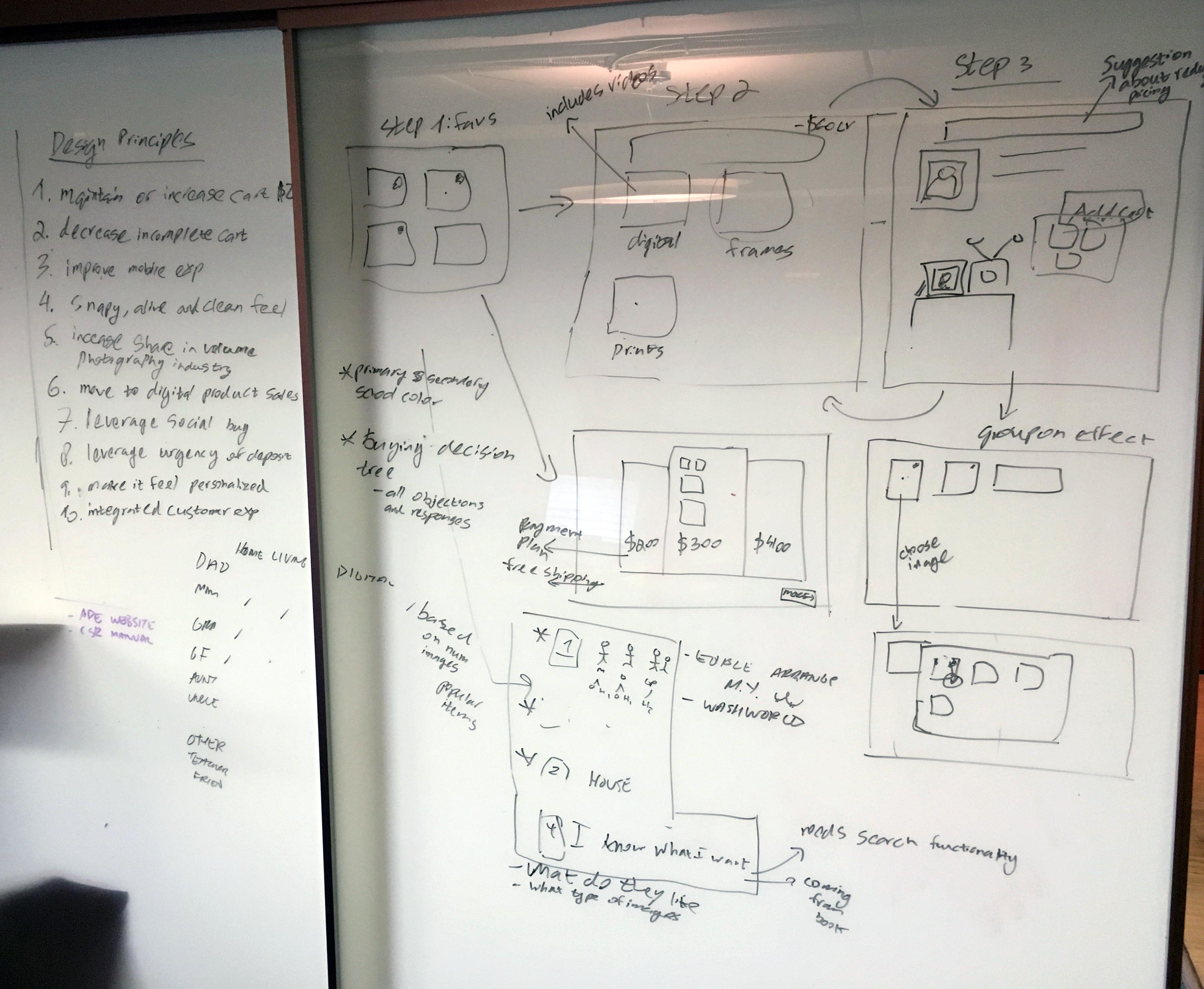
Exploring different design alternatives with the Artona team
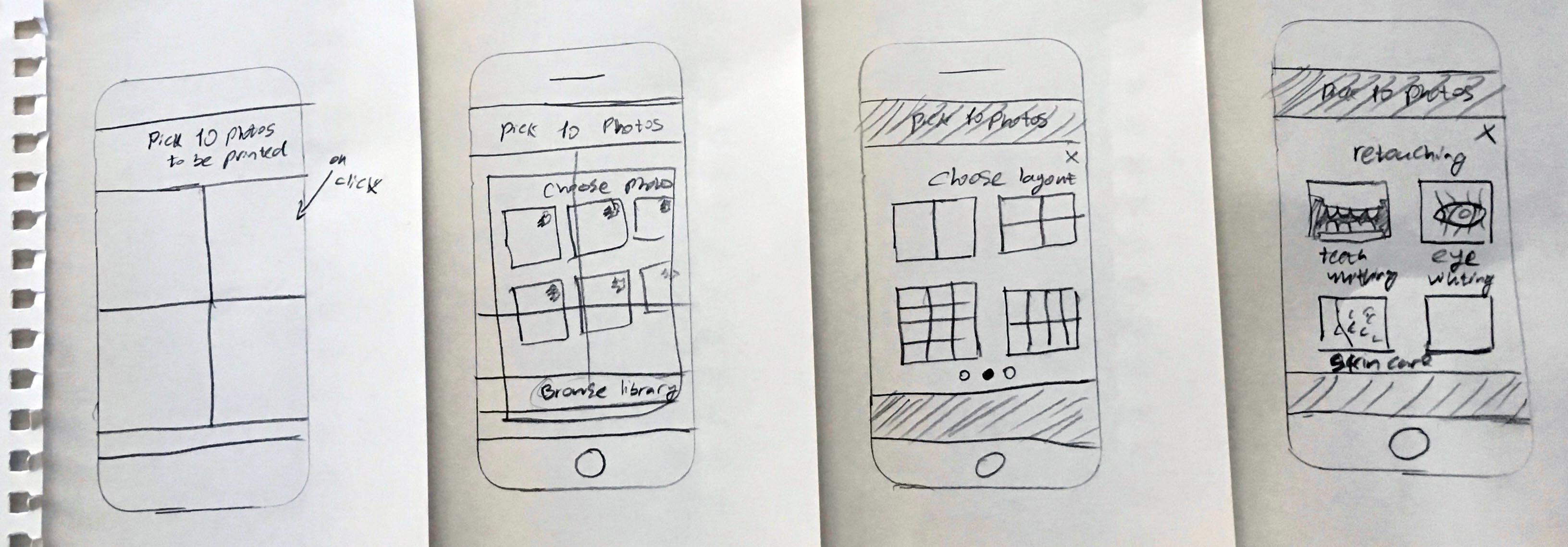
Early paper prototypes prior to building a high fidelity
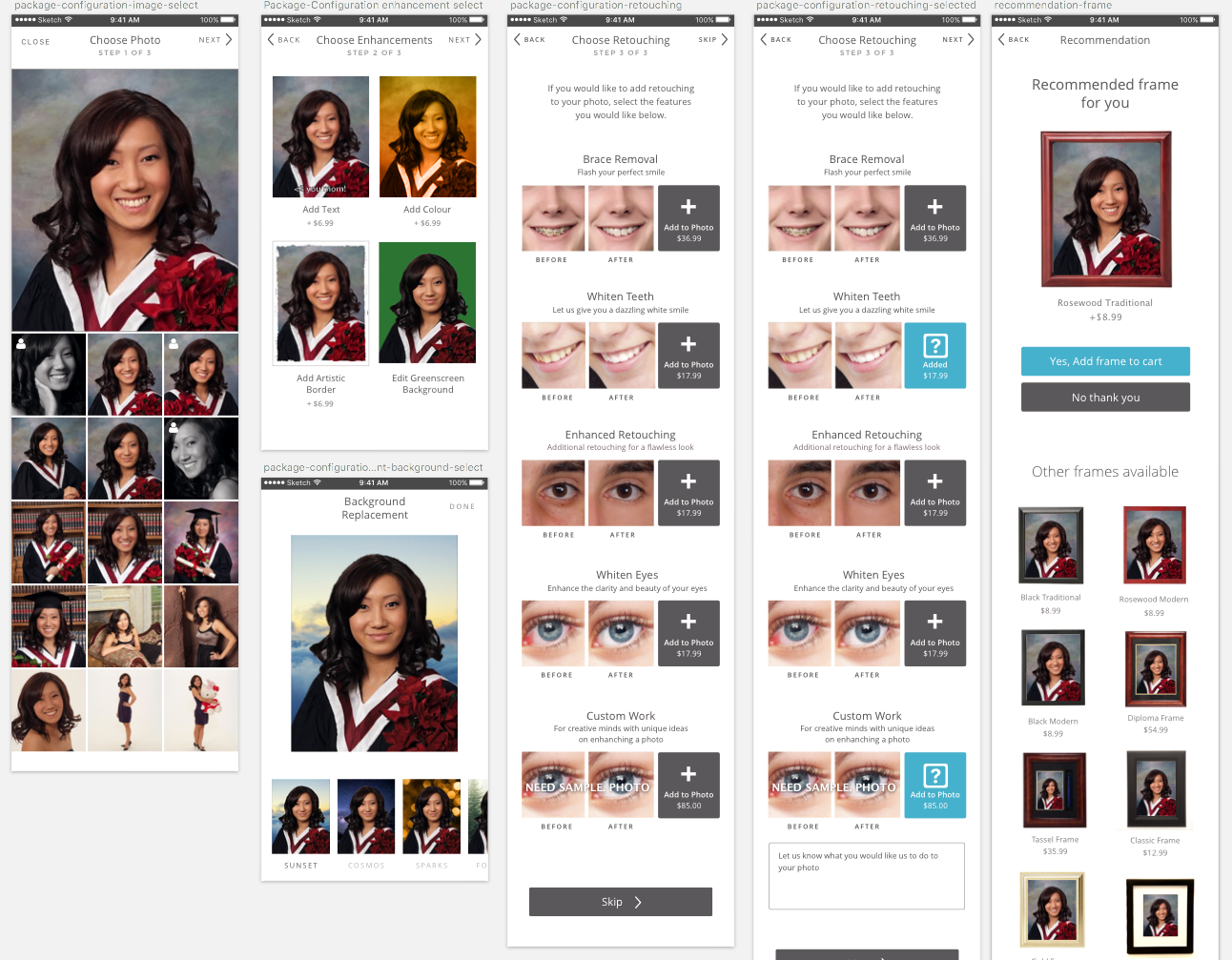
High fidelity prototypes in sketch
As we had our designer cleanup type faces, fonts, spacing, etc on the visual design portion, we began working on the code.
Technology
Now that we knew what things would look like, we took another look at the React/Redux eco-system to see what has changed since our last project. We then worked closely with the backend developer to create the app skeleton.

The stack we used for technical development
We spent the next few months building an incredible react/redux app that rivalled well-polished native iOS applications. We knew we were onto something when we showed it to users and they asked us “do we need to download this app?”. When we said it was simply a website, they couldn’t believe it. They have yet to see an experience so smooth outside of a native app.
In January 2017, we demoed the app with Artona and their partners at an industry conference called SPAC. Other studios all came excited to our booth to see the legendary purchasing experience that they’ve heard about.
After the conference, we focused on getting feature parity between the desktop and new mobile app. We planned on rolling it out slowly to one school at a time. To achieve this phased rollout, we created a feature flag that allowed us to turn on the mobile for just one student, one school or an entire studio. We started by testing it with live orders on a small group of student (~50 students). After we were happy with the results, we turned it on for all the students at a few schools, then for the entire studio.
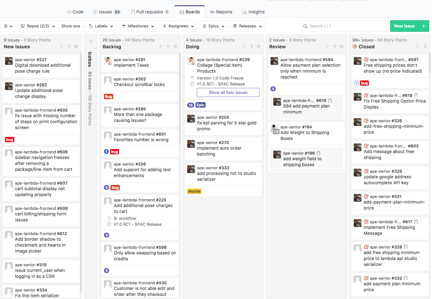
busy Kanban board with tasks at different stages
The Outcome
All the studios on Ape Projects now have a mobile experience their customers enjoy using and keep complementing them about. Rollout of the mobile app didn’t require any major migrations or extra work from the studios or their staff. It was as simple as flipping a switch on the admin backend.
Mobile users are now able to order straight from their device instead of being forced to go on their desktops to place their order.